The Psychology Behind Typography And Why It Matters To Marketing
Mar 19, 2024
Recently, a client for whom Stout Heart did branding work for, told us the story of struggling with internal stakeholders who had a habit of disregarding the brand guidelines (and if you have any question about the importance of said guidelines, we’re gonna go ahead and send you here) that it was his job to protect with his life. When developing presentations and reports for clients, he said, they regularly disregarded the brand fonts and the hierarchy laid out for them in his company’s branding. This leaves him policing his team and trying to explain why this hierarchy is so important even though it seems so unimportant.
Stout Heart is a brand-centric agency. What does that mean? Everything we do goes back to the brand. If that’s not as buttoned up and strategically-rooted as it can possibly be, the flaws will show down the line (in your website, in your marketing, at some point it will show). So when we hear that a brand guideline is being disrespected we are… Appalled. Mortified. Horrified. Should we find you another synonym? You probably get the point. In case you’re wondering why we care so much, let’s back up a few steps and talk a bit about typography.
Typography: the style, arrangement, or appearance of typeset matter. Thank you, Merriam-Webster.
Type plays a crucial role in graphic design, branding, and marketing because it makes written language legible, readable, and visually appealing. Beyond its aesthetic function, typography has a profound psychological impact on how people perceive and interpret the information that they read. Understanding the psychology behind typography is essential for designers, marketers, and brands alike, as it influences consumer behavior, brand recognition, and communication effectiveness. Allow us to continue to geek out here for a bit.
The Power of Perception
Typography is more than just selecting fonts; it’s about conveying emotions, setting the tone, and guiding the reader’s perception. Different fonts evoke different feelings and associations, influencing how a message is received.
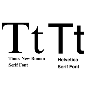
For example, serif fonts like Times New Roman or Garamond are often associated with tradition, formality, and authority, making them suitable for legal documents or academic publications or uses where tradition and trust are a priority.
Sans-serif fonts, on the other hand, like Helvetica or Arial convey modernity, simplicity, and clarity, making them popular choices for contemporary designs and digital interfaces. Take a look at the examples below. Same imagery, different fonts. How does each make you feel? What assumptions do you make about each bank based on the typography used alone?

Cognitive Processing and Readability
The human brain processes written information differently based on typography choices. Factors such as font style, size, spacing, and alignment affect readability and comprehension. Research has shown that serif fonts enhance reading speed and comprehension in print media (it’s science), while sans-serif fonts are more effective for on-screen reading due to their clarity and simplicity (more science). Moreover, appropriate line length and spacing prevent cognitive overload, making it easier for readers to absorb information without feeling overwhelmed.
And if you want to go down another fascinating rabbit hole, typography has a significant impact on accessibility. Individuals with dyslexia, which affects 1 in 5 Americans, find sans serif fonts improve legibility (even more science). We learned this when working with Lexington Academy on their branding. It’s important to note that different accommodations need to be taken
under consideration depending on the nature of the project at hand. As the world of design, particularly user experience and digital design, accessibility becomes more and more of a priority and it’s important to pay attention to this even though it can sometimes feel like a moving target.
Brand Identity and Recognition
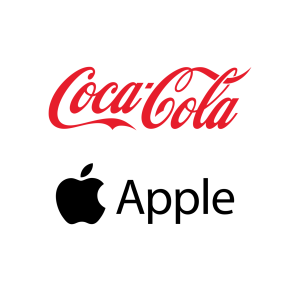
Typography plays a pivotal role in brand identity, helping companies establish a unique and recognizable visual presence. Consistent use of typography across various touchpoints, such as logos, websites, packaging, and advertisements, reinforces brand recognition and strengthens brand association. For instance, the distinctive typography of Coca-Cola’s logo instantly evokes the brand’s heritage and authenticity, while the sleek typography of Apple’s product packaging reflects its commitment to innovation and sophistication.
Emotional Engagement and Persuasion
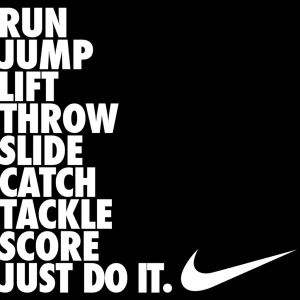
Typography has the power to evoke emotions and influence behavior (are you getting tired of the science?). By choosing the right fonts, designers can create an emotional connection with the audience, triggering desired responses and actions. For instance, bold and dynamic fonts are often used in marketing campaigns to convey excitement, urgency, or energy, encouraging consumers to take immediate action. Similarly, elegant and sophisticated fonts can evoke a sense of luxury and exclusivity, appealing to high-end consumers and enhancing perceived value. Take a gander at the examples below from Nike and Dior. Different audiences. Different vibes. Different typography.

Cultural, Societal, and Trend Influences
Typography is deeply influenced by cultural and societal norms, reflecting the values, trends, and preferences of different demographics. Some cultures may prefer calligraphic or ornate fonts that honor traditional craftsmanship and heritage, while others may lean towards minimalist and functional fonts that prioritize clarity and efficiency. Understanding cultural nuances is essential for global brands aiming to resonate with diverse audiences and avoid unintentional misunderstandings or misinterpretations.
In addition to this, we can’t forget that with design comes trends. You know how sometimes you look at pictures of houses and when you see a kitchen that clearly was built in the 90’s you know it immediately? The same can be said of typography. It’s not necessarily a bad thing to utilize fonts that might be considered trendy but it’s important to consider why you are. Are you working with a brand trying to attract young people or are you trying to evoke a more classic feel? It makes a difference.
The Role of Typography in User Experience
In the digital age, typography plays a crucial role in enhancing user experience across various platforms and devices. Responsive typography ensures optimal legibility and readability across different screen sizes and resolutions, enhancing accessibility and usability. Moreover, strategic use of typography hierarchy, such as headline fonts, subheadings, and body text, guides users through content hierarchy and improves information organization (not to mention that it’s critical to have these sorted out for the sake of SEO). By prioritizing readability and user-centric design, brands can enhance engagement and retention, fostering positive user experiences.
Psychological Principles of Typography
If you can related to our branding nerdiness, this will be icing on the case for you. There are several psychological principles underlie the impact of typography on perception, cognition, and behavior. Here we go…
Gestalt Principles
Gestalt principles, such as proximity, similarity, and closure, explain how humans perceive and organize visual elements. Typography leverages these principles to create cohesive designs that are easy to understand and navigate. For example, consistent spacing and alignment between letters and words enhance readability by maintaining visual harmony and flow.
TLDR: It makes the human brain happy.
Color Psychology
Color psychology explores how colors influence human emotions, perceptions, and behaviors. Typography (and all design) can incorporate color to evoke specific moods, reinforce brand identity, and highlight important information. For instance, warm colors like red or orange may convey energy and excitement, while cool colors like blue or green evoke calmness and trust.
Cognitive Load Theory
Cognitive load theory examines the mental effort required to process information. Typography choices can either reduce or increase cognitive load, affecting information retention and decision-making. For example, excessive use of decorative fonts or complex typography styles may overwhelm readers, leading to cognitive fatigue and disengagement.
TLDR: There are good reasons for our brains to hate fonts like Comic Sans.
Priming Effects
Priming effects occur when exposure to certain stimuli influences subsequent thoughts and behaviors. Typography can prime audiences by setting expectations, framing perceptions, and directing attention. For example, bold and prominent fonts draw attention to key messages or calls to action, priming users for action and increasing response rates.
The Importance of Typography Hierarchy To Design
This one’s for our perplexed client sorting out coworkers who use font sizes willy nilly. Turns out, typography hierarchy is a fundamental aspect of design, playing a crucial role in guiding the viewer’s attention, organizing information, and conveying the intended message effectively. In essence, it refers to the arrangement and prioritization of different typographic elements such as font size, weight, color, and style within a design layout. Here’s why typography hierarchy is so important to design:
- Visual Organization: Typography hierarchy provides a clear visual structure to the content, making it easier for viewers to navigate and comprehend. By varying the size, weight, and style of typefaces, designers can establish a hierarchy that emphasizes the most important information while de-emphasizing secondary details. This organization helps users to quickly identify key points and understand the content hierarchy at a glance. Even when a user doesn’t take a moment to acknowledge the importance of this to the way that they process information, it is there.
- Information Clarity: In designs where multiple pieces of information are presented (e.g. articles, websites, or posters), typography hierarchy ensures that each piece of information is distinct and easily distinguishable. Headings, subheadings, body text, captions, and other typographic elements are differentiated in size and style, preventing confusion and enabling readers to grasp the content hierarchy effortlessly.
- Visual Flow: A well-executed typography hierarchy guides the viewer’s eye through the design in a logical sequence, leading them from the most important elements to the supporting details. This controlled flow enhances readability and engagement, keeping the audience focused on the content without feeling overwhelmed or lost. Whether scanning a webpage, reading a brochure, or perusing a magazine layout, an effective hierarchy facilitates a smooth reading experience.
- Brand Identity: Typography plays a significant role in defining a brand’s visual identity. Consistent use of typography hierarchy across various brand assets such as logos, websites, packaging, and marketing materials helps reinforce brand recognition and evoke a sense of familiarity among audiences. The choice of fonts, their sizes, and how they are arranged communicate the brand’s personality, values, and positioning in the market.
- Emotional Impact: Beyond mere communication of information, typography hierarchy can evoke emotions and set the tone of a design. The use of bold, attention-grabbing headlines coupled with elegant, readable body text can create a sense of authority and professionalism. Conversely, playful fonts and whimsical arrangements can convey a more light-hearted or creative tone. By leveraging typography effectively, designers can elicit specific emotional responses from their audience.
- Accessibility: Typography hierarchy also plays a crucial role in ensuring accessibility for all users, including those with visual impairments. Clear differentiation between headings, subheadings, and body text, along with appropriate contrast ratios and font sizes, improves readability for individuals with various visual abilities. Designers must consider accessibility guidelines and best practices when establishing typography hierarchy to ensure inclusivity and usability for all users.
- Aesthetic Appeal: Typography is not only about functionality but also about aesthetics. A well-crafted typography hierarchy enhances the overall visual appeal of a design, making it more aesthetically pleasing and engaging. Harmonious combinations of fonts, balanced proportions, and careful spacing contribute to the overall attractiveness of the design, drawing viewers in and encouraging them to explore further.
Conclusion
Typography is a powerful tool that goes beyond mere aesthetics; it shapes perceptions, influences emotions, and drives actions. By understanding the psychology behind typography, designers and marketers can harness its potential to create compelling visual experiences, build strong brand identities, and effectively communicate with their target audiences. Whether it’s through branding, marketing, or user experience design, typography plays a central role in shaping the way we perceive and interact with the world around us. As technology evolves and consumer preferences change, the importance of typography in graphic design, branding, and marketing will continue to grow, shaping the future of visual communication and storytelling.
We don’t expect just anybody to care as much as about this stuff as we do. We know we live in our own happy branding bubble. But we do think it’s important for folks who work with a brand (and that goes beyond just marketers) to understand the importance of each typography-related decision that they make. Show that brand some respect!
Like what you see here and want to talk more? Get in touch!
Interested in working with us? Reach out. We’re excited to hear from you.
Contact